Get us in your inbox

  1. ‘Pod’ (The Breeders, 1990)
    The Breeders, 1990

    ‘A male fertility dance, in response to some very visceral music from an almost all-girl band. Kim Deal has a sense of humour to which I was trying to appeal. I also loved her, and in an attempt to woo her I strapped on a belt of eels and danced for Westenberg’s camera. No Photoshop – just a long exposure. It needed to be long to accommodate the appendages.’

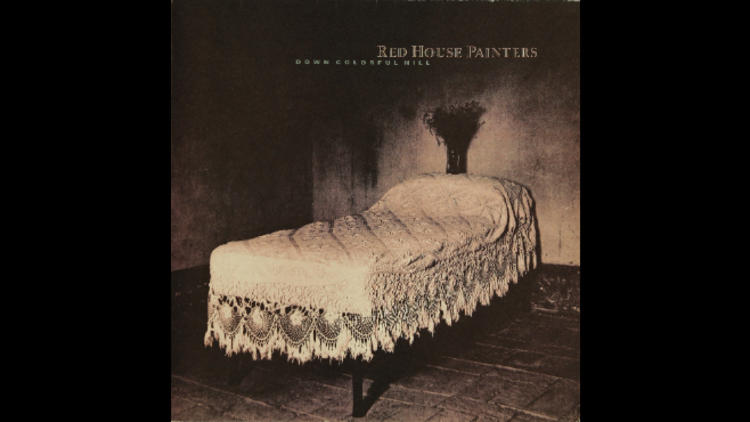
  2. ‘Down Colorful Hill’ (Red House Painters, 1992)
    Red House Painters, 1992

    ‘We always try to reflect the “atmosphere” of the music. This is one of our more successful attempts. Something in the lyrics about a big bed in a small room brought to mind a photo of Simon Larbalestier’s: a ready made. I like the pubic triangle above the pillows.’

  3. ‘Colourbox’ (Colourbox, 1985)
    Colourbox, 1985

    ‘Another ready-made. The sheet was found on a printer's scrap pile in Japan by a friend-cum-tutor cum-landlord, and gifted to me when I arrived in London in 1980. It seemed to fit Colourbox’s groundbreaking magpie/sampling approach perfectly.’

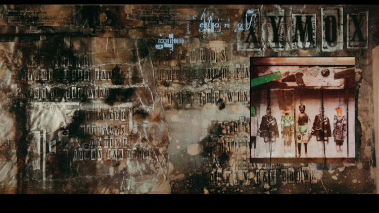
  4. ‘Clan Of Xymox’ (Clan Of Xymox, 1985)
    Clan Of Xymox, 1985

    ‘I was excited by the idea of taking the track listing and working it as an image: information as illustration. I hadn’t seen this idea realised in this way previously. Our aim was always to try and break new graphic ground, to experiment and pervert convention. Terry Dowling, my old tutor at Newcastle, provided the puppet print representing the band members. Terry remains one of my biggest influences. He opened my mind to new ways of thinking.’

  5. ‘Stars on ESP’ (His Name Is Alive, 1996)
    His Name Is Alive, 1996

    ‘Warren Defever of HNIA talked about the mitten shape of his home state, Michigan. When natives of this state meet they hold up their hands and point to which part they come from: “How!” Like Indians. I love oven gloves, and photographer Dominic Davies made this super picture. On the back sleeve we are making a star on a kitchen table, inspired by the idea that we are all stardust.’

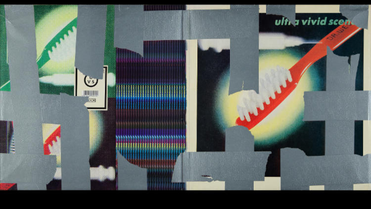
  6. ‘Ultra Vivid Scene’ (Ultra Vivid Scene, 1989)
    Ultra Vivid Scene, 1989

    ‘Kurt Ralske of UVS would give me pages torn from old magazines. This is an advert for toothbrushes, but in its new context the syringe takes on more sinister connotations. That’s when re-appropriation is valid. The multiple spines on the back were inspired by a walk through the 4AD warehouse next to our studio space. The silver gaffer tape idea came from a package that was sat next to my desk at the time, but also connected with the view of a stage set where all the wires are taped down.’

  7. ‘Lonely Is an Eyesore’ (Various 4AD artists, 1987)
    Various 4AD artists, 1987

    ‘This limited-edition (100 copies) box set from 1987 contained vinyl, video, cassette, cd, etching and screenprint. This was a compilation of everybody on the roster, and it marked a watershed moment in 4AD’s evolution. I knew I was in the right place with the right man – Ivo Watts-Russell – when he went for this deluxe concept housed in American beech and gave half of them away to the musicians involved. He sold the rest at a give-away £100 each: the V&A Museum bought one for their archives. The image on the front of the sleeve is a picture of the baseboard of our artwork camera – a picture of nothing, basically. I like that.’

  8. ‘Minotaur’ (Pixies, 2009)
    Pixies, 2009

    ‘Another box set. We threw out all the old Pixies artwork and started again. Working with photographer Larbalestier and a group of students at UCA Epsom, I designed a large-format book and packaging to hold all Pixies album back catalogue. I saw this package as a response to the diminishing presence of the music package: an antidote if you like.’

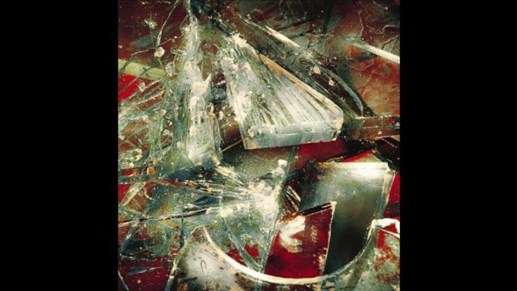
  9. ‘Mountain Battles’ (The Breeders, 2008)
    The Breeders, 2008

    ‘Searching for beauty in violence, we were trying to echo the spirit of the Fauvist painters and the fractured nature of some of their work. I suggested to photographer Marc Atkins that we use glass – very easy for me to say. I still can't understand how Marc brought such life to the inanimate sheets of glass on his studio floor. The man is a genius.’

  10. ‘Doolittle’ (Pixies, 1989)
    Pixies, 1989

    ‘“Five, six, seven… this monkey's gone to heaven,” was the refrain on the supporting single. [Photographer Simon] Larbalestier shot the monkey. Who shot the Sheriff? I liked the challenge of using exactly the same photo from that sleeve, and processing it to reflect the screenprint medium. Meanwhile, [Pixies frontman] Black Francis broke my heart by telling me that successful pop music was simply the intellectual pursuit of good mathematics. Simple me – I thought it all came from the heart. Then I remembered that Golden Section theory used in the composition of Renaissance painting, so I made my own grid to place over the monkey.’

  11. ‘Indie Cindy’ (Pixies, 2013)
    Pixies, 2013

    ‘Not for 4AD, but my most recent piece of work featuring front sleeve illustration by Ian Pollock. It’s mischievous and provocative and very beautiful. I’ve followed Pollock’s work for 33 and a third years but I’d never had the opportunity to commission him. It’s a fresh move for the Pixies artwork, and one which I’d love to continue. The inner sleeve in fluorescent orange and gold foil is quite a surprise.’

Vaughan Oliver's favourite 4AD artwork

The designer of iconic covers for Pixies, Cocteau Twins and Throwing Muses picks his most-loved from a 30-year career

Advertising
On September 26, ‘Facing the Other Way: The Story of 4AD’, a book by Martin Aston which documents the history of iconic record label 4AD, hits the shelves. Ahead of the account's publication, 4AD graphic designer Vaughan Oliver picks his ten favourite record sleeves. In typically contrary style (‘Top Ten is a bit conventional’) he's picked 11… Martin Aston's new book, ‘Facing the Other Way: The Story of 4AD’, traces the history of the groundbreaking, London-based record label from its post-punk origins in 1979 to the departure of founder Ivo Watts-Russell two decades later. During that time, 4AD put out pioneering records by Pixies, Bauhaus, The Breeders, Cocteau Twins, The Birthday Party, Dead Can Dance, Throwing Muses, Red House Painters, This Mortal Coil (the label’s in-house project, occasionally featuring Watts-Russell on keyboards) and a handful of other era-defining artists.

It’s an impressive musical legacy – but just as influential and enduring are Vaughan Oliver’s album sleeves for the label. Oliver has worked on and off with 4AD and its artists since the early ’80s, creating some of their most eye-catching artwork and designs, and helping to define the label’s visual aesthetics. Oliver created the cover of ‘Facing the Other Way’, which includes many of his truly iconic designs.

Buy 'Facing the Other Way: The Story of 4AD’ here

Read more music features

Advertising
Advertising
Advertising
Advertising
Recommended
    You may also like
    You may also like
    Advertising