[category]
[title]

ESPN's Uni Watch, a column that analyzes and documents the history and current state of sports uniforms, released a ranking of the best dressed cities according to their professional sports teams' uniforms. Out of the 20 cities in North America with at least three major sports teams, Chicago ranked third behind Boston and Pittsburgh. Here is how Uni Watch ranked each Chicago team's uniforms, along with some criticism of their picks.
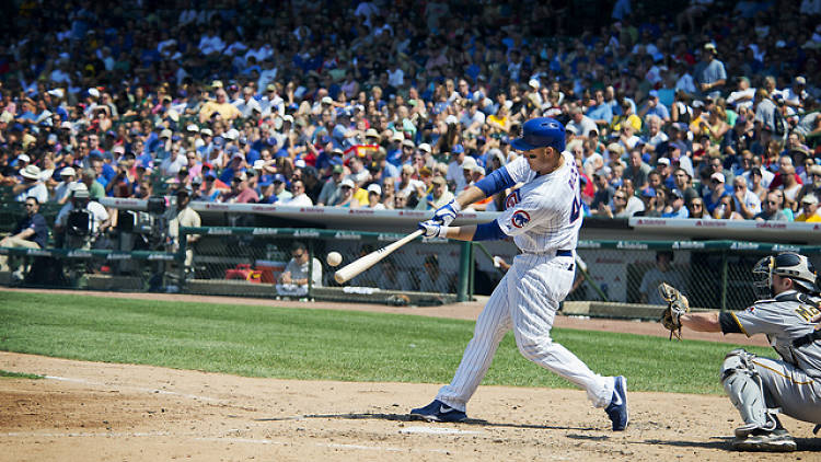
Cubs, 9.5/10: No argument here—the traditional home uniforms look sharp with the blue pinstripes and primary logo on the chest, and the alternate blue jerseys with the secondary Cubs logo on the front are also a good look. At least Cubs have gotten the "look good" part of the "look good, play good" equation right for most of their history.
White Sox, 7.5/10: Like their North Side counterparts, the Sox also wear a nice set of pinstriped home uniforms with their primary logo on the chest. The black alternate uniforms also make for a great contrast, especially against teams with more colorful threads. But the Sox look their best when they dive into the past and choose from their rich history of uniform selections, which include the red-trimmed uniforms of the "Go-Go Sox" era and the 1983 navy-and-red throwbacks.
Blackhawks, 7/10: Come on. This ranking should be at least an 11 out of 10. The Blackhawks' Native American head is arguably one of the best logos in sports. Emblazoned on their sweaters, especially the home reds, along with the alternate "Tomahawk" logo on the shoulders and the classic stripes running along the sleeves and bottom, make these far and away the best uniforms of any team in Chicago.
Bulls, 6.5/10: As with most basketball uniforms, the Bulls don't have much going on with their design. They've mostly kept with the same, simplistic design for several years. If it was good enough for Michael Jordan to win six NBA titles in, it's good enough for anybody.
Bears, 10/10: This classic look has stayed mostly unchanged for the franchise's history, and for good reason. The stylized "C" on the helmets, navy blue and orange, and the placement of George Halas's initials on the sleeve are a perfect look for a team that prides itself on tradition. It looks just as good now as it did 50 years ago. Now, if the club could just put these uniforms on some players who are good at football, then we'd all really have something to be excited about.
Intangibles: Uni Watch assigned two bonus points to Chicago for having Wrigley Field, which is nice, but there should have been more. We should have been given at least one more for the exploding, pinwheel scoreboard at Sox Park. One could also argue that Chicago deserves more bonus points for the Doric columns at Soldier Field—until you remember that they built a giant alien spacecraft on top of it.
As Uni Watch points out, Chicago's sports teams (with the exception of the White Sox) tend to stick with the same uniform design for long periods of time. That's because they have an eye for design. As for the cities ahead of us: Pittsburgh may have matching colors across all sports, but it's the colors of street pavement so whatever, and Boston should have bonus points taken away for the strange breed of people who come out of that city. Chicago definitely belongs at the top of these rankings.
Discover Time Out original video