For those who aren’t familiar with ‘Breakfast at Tiffany’s’, ‘the mean reds’ is Holly Golightly’s celebrated phrase for nameless anxiety. When Truman Capote was writing, in the late 1950s, the colour choice of such angst was culturally suspect. Ask someone with emotion-colour synaesthesia how anxiety appears, and it is likely to be much less monolithic, way more poetically pleasing: dappled fawn edged in vermillion, perhaps.
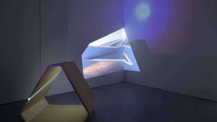
Laura Buckley’s ‘The Mean Reds’ – an interleaving installation of three pieces, throughout which video projection, surface, bulk and sound overlap – goes some way to figuring a complex anxiety. Snippets of video of the surfaces and conduits of everyday spaces are accompanied by an amalgamated soundtrack of ambient and orchestrated noise that lapses into such cinematic truisms as child-like voices and plinking and swelling strings – which, like the images, never quite clarifies.
A shape specific enough to seem important – a truncated triangle – recurs in the interlocking coloured Perspex that forms a crazy tower-like model in ‘Marcelo’s game’ and in the extruded plywood frame through which video snatches of Berlin are projected. This, it turns out, was taken from a logo on a bus shelter, while another location, Tarifa in Spain, provides Buckley with the lyrical phenomenon of two opposing winds that are fabled to produce anxiety in locals. Contaminating the banal with the significant and, vice versa, displacing motifs and scrambling fragments could indeed be pathologised as signs of trauma, but inevitably, in a gallery, this is more likely to be received as blithesome formalism.
