
[title]
If you've spent the last few days sweating it up on the Underground, you'll know that there's nothing cool about rush hour in London. But this animated tube map, which shows the busiest times on the tube, is very cool.
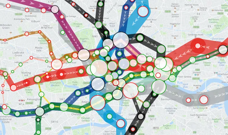
Here it is in all its bulgy glory:

It's been designed by UCL researcher Oliver O’Brien, who's used data published by TfL to create this amazing visualisation of London's tube network in action. He's called this cartological creation Tube Heartbeat, as the map shows the number of passengers using the tube in 15-minute intervals throughout the day, and the tube lines 'pulse' as it gets busier.
You can also click on individual stations to find out its peak entry time, as well as a colour-coded bar chart of the number of entries, exits and interchanges throughout the day. Or you can click on the tube line between two stations to get some stats on that particular interchange. It really is the stuff of a transport geek's dreams.

Ready to lose hours of your day? Play around with the Tube Heartbeat map for yourself
Want to see more cool maps? You can see the original tube map drawing at a new British Library exhibition
In other tube news, all the adverts at Clapham Common tube station have been replaced with pictures of cats
And air conditioning on the tube could actually make trains hotter