Get us in your inbox

Search
  1. Seating fabric

    The next time you see an unruly youth using a tube seat as a foot rest, give them a stern warning and a history lesson about London transport's gloriously durable moquette seating, which was introduced in 1938 and produced by lauded textile designers, rather than factory grunts. Then run away before they start shouting dubstep lyrics at you.

  2. The posters

    Back before the days when carriages were dominated by ads for dating websites and mobile phone deals, buses and tubes were decked out in a more subtle class of signage. The best are currently being celebrated at the London Transport Museum's Poster Art 150 exhibition, which includes designs by Man Ray, Graham Sutherland and Harry Beck - the chap behind the tube map.

  3. Charles Holden's stations

    Charles Holden – the architect behind the imposing design of Senate House – was commissioned to build several Underground stations in the 1920s and '30s. Though no two are alike, Holden's modernist touches in the facades of Arnos Grove, Wood Green and Northfields stations (among others) are hard to miss. Here's Southgate station, making absolutely no apologies for looking a bit like a flying saucer made of bricks.

  4. Platform motifs

    London's tube stations are full of nifty little nods to their surroundings – especially those on the Victoria line, where each stop sports a tiled tribute to the local area on its platforms. Some are pretty self explanatory, (like the portrait of Queen Victoria at Victoria), but others require the sort of attention you're unlikely to find in your average rush-hour commuter. A maze at Warren Street? Think about it…

  5. The font

    We appreciate it can be difficult to get excited about what's essentially a page of sans serif lettering. But then again, just LOOK AT IT. What's that? Northern line down all weekend? We don't even care.

  6. R stock trains

    While the new batch of air-conditioned, walk-through trains doing the business on the Circle line are pretty slick, aesthetically speaking, the 21st century's got nothing on these classic trains, which ran on the District line from 1949 to 1983. Inside that pioneering aluminium shell the colours were muted, the floors wooden and absolutely nobody played 'Angry Birds' at full volume.

  7. The logo

    Used as part of station signage as early as 1908 (incorporating a solid red circle, rather than the more familiar ring), the London Underground roundel became the network's official logo in 1917. It's since become one of the most instantly recognisable images in London, as well as the preferred signifier of English pubs in foreign countries.

  8. Subterranean ticket halls

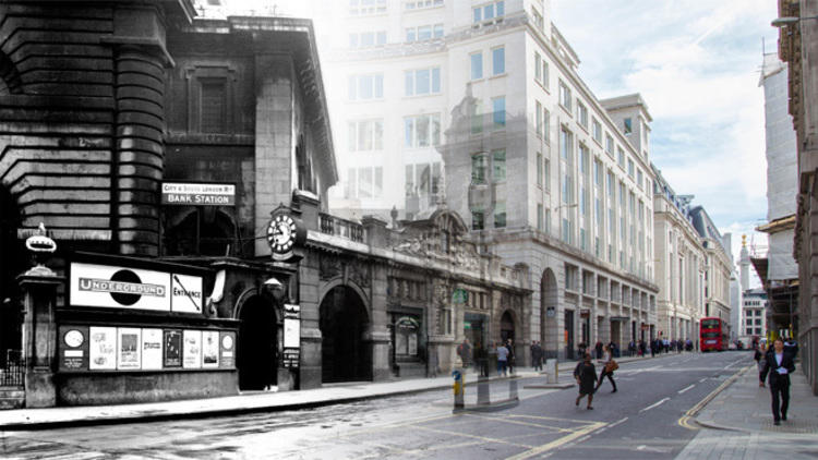
    Passenger numbers at Piccadilly Circus rose more then ten-fold between 1907 and 1922, necessitating major reconstruction work that included an underground ticket hall of the sort London had never seen before. And while these days tourists have made sure there's rarely room to swing a kitten, Piccadilly Circus quickly became an internationally renowned feat of engineering, with town planners and architects from across Europe seeking consultancy advice from London on underground construction.

  9. The RT type bus

    The 1950s Routemaster may get all the nerdy love, but it was the 1939 RT type bus that defined the shape of London's 20th century street-level commuting. Over 7,000 of these beauties were built in total – that's a lot of red paint.

  10. The tube map

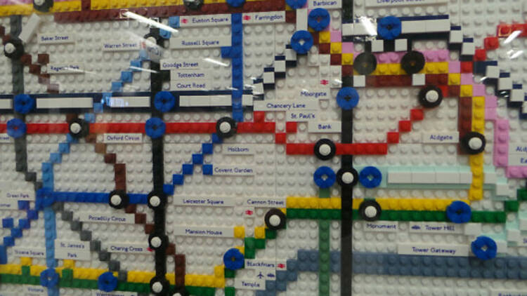
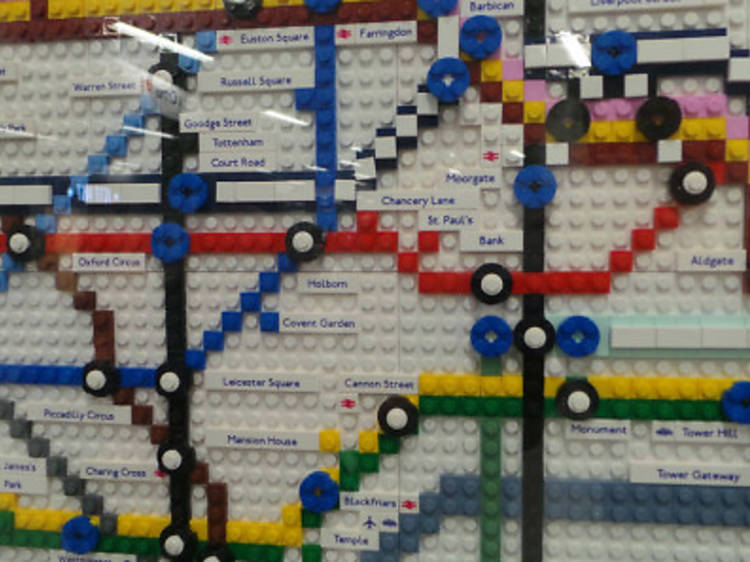
    It's unlikely that when Harry Beck produced his diagrammatic overhaul of the tube map back in 1933 he ever imagined it'd become such an iconic design. These days, the modern evolution of Beck's map can be found on everything from tea mugs to boxer shorts, and continues to spawn endless spoofs and mash-ups.

London transport's 10 greatest designs

From intuitive maps to bafflingly brilliant feats of engineering, the people behind our buses and tubes never cease to amaze. Here's our pick of 10 design classics

Advertising
The problem with design classics is that, by merit of their brilliance, they become so ubiquitous that they practically disappear from the public consciousness. Still, if someone took away our Oyster cards, say, or changed the tube map, there'd be a torch-bearing mob encircling City Hall before you could say 'mind the gap'.

As new book 'Frank Pick's London: Art, Design and the Modern City' illustrates, London's transport network changed the face of the city throughout the 20th century. Not simply by getting us from A to B, but also with its constant stream of innovative, pioneering world-leading design. Here's our pick of ten of the best for your appreciation.

'Frank Pick's London: Art, Design and the Modern City' by Oliver Green is out in November from V&A Publishing, priced £25.00 (hardback). Available from the V&A Shop or online at www.vandashop.com. All images are copyright London Transport Museum

More London transport features

Advertising
Recommended
    You may also like
    You may also like
    Bestselling Time Out offers
      Advertising