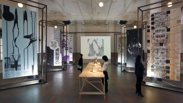
From Nov 11, Typojanchi 2015 is being held at the Culture Station Seoul 284 (former Seoul Station). Hosted by the Ministry of Culture, Sports and Tourism and operated by Korea Craft & Design Foundation (KCDF) and the Korean Society of Typography, Typojanchi is the only typography biennale in the world. Following its last exhibition “Supertext” in 2013, where they dealt with the relationship between literature and typography, they are now holding their 4th biennale under the themes of city and typography. As cities became the main elements of modern society, examining typography and people through designers’ eyes to seek to find out how they view things is the objective of this year’s event.
The subject of this year’s exhibition is “C( )T( ).” Getting rid of vowels and replacing them with empty parenthesis shows the experimentalism of the exhibitions’ compositions. In fact, the easiest way to bring cities and typography together is to use the entire city as an exhibition hall and to hold diverse events in it. But this year, they brought almost all of the elements of the biennale to the Culture Station Seoul 284. Twenty-five Korean and non-Korean artists participated in the main exhibition and famous British designer Adrian Shaughnessy curated a special display for which he visited different cities around the world like Mexico City, New York and London. Here, ten exhibitions in total are waiting for the visitors. The venue of this biennale, a two-story neoclassical building, was designated as a cultural heritage and it naturally accepts typography. They space has been transformed into a place where classics and modernity coexist. It’s possible for you to call it the rebirth of a small typographic city.
There are a number of ways to enjoy this typographic city during the exhibition. The most standard means would be to make full use of the information given by the hosts. When you visit this city of letters, you first fill out a simple questionnaire about the area you are living in. This biennale’s newspaper-sized newsletters are regularly published and in its latest 5th issue, they talk about the exhibition in general, explain its subjects and introduce its artists. The newsletter serves as the exhibitions’ brochure and guidebook. You can read through all the information written in the guidebook and use the questionnaire you finished to find out what you might find to be the most interesting. Otherwise, you can just wander around the place and enjoy the works. You don’t have to worry about getting lost as the paths are clearly laid out. The bustling alley inspired by the streets of Jongno, a parlor where you can observe people in the city through the elements of languages and a room of illusions where hosts greet their visitors are smaller exhibition halls that serve their purpose as presenters and symbols of diverse horizons of this typographic city.
In order to gain a deeper understanding on this international biennale, visit RTO located on the right side of the exhibition venue where you can take part in curators’ talks held every Saturday. In December “Urban Wordplay,” “City Welcomes You,” “Book Bricks,” and “A city without ()” will be the subjects discussed. But the exhibition itself is not too hard to understand and because it employs various types of media, you won’t have a problem following things even if you don’t know a lot about the topic so long as you are curious to learn. You can also check out their website. The exhibition goes on until Dec 27.
By Jeon Jong-hyun (Design journalist)
