
[image]
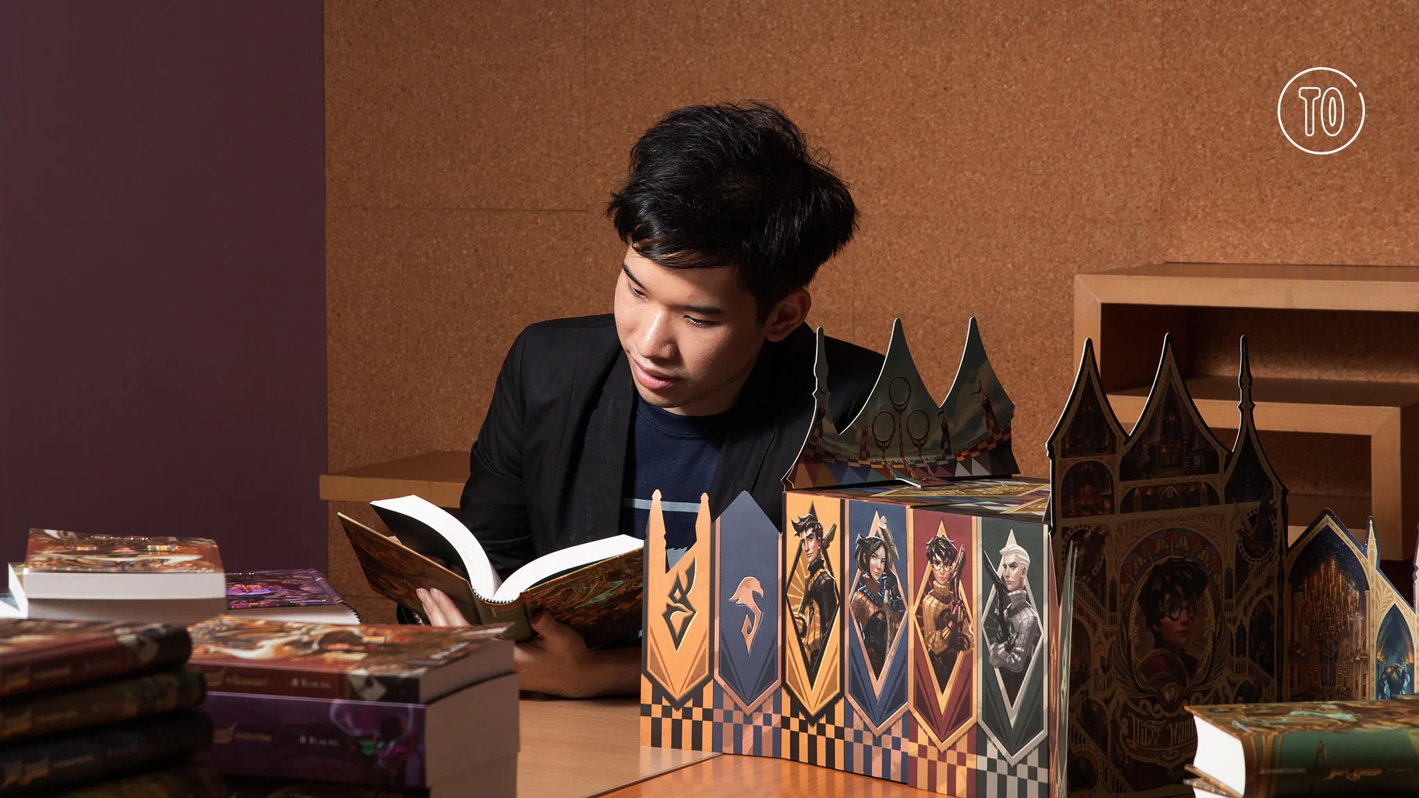
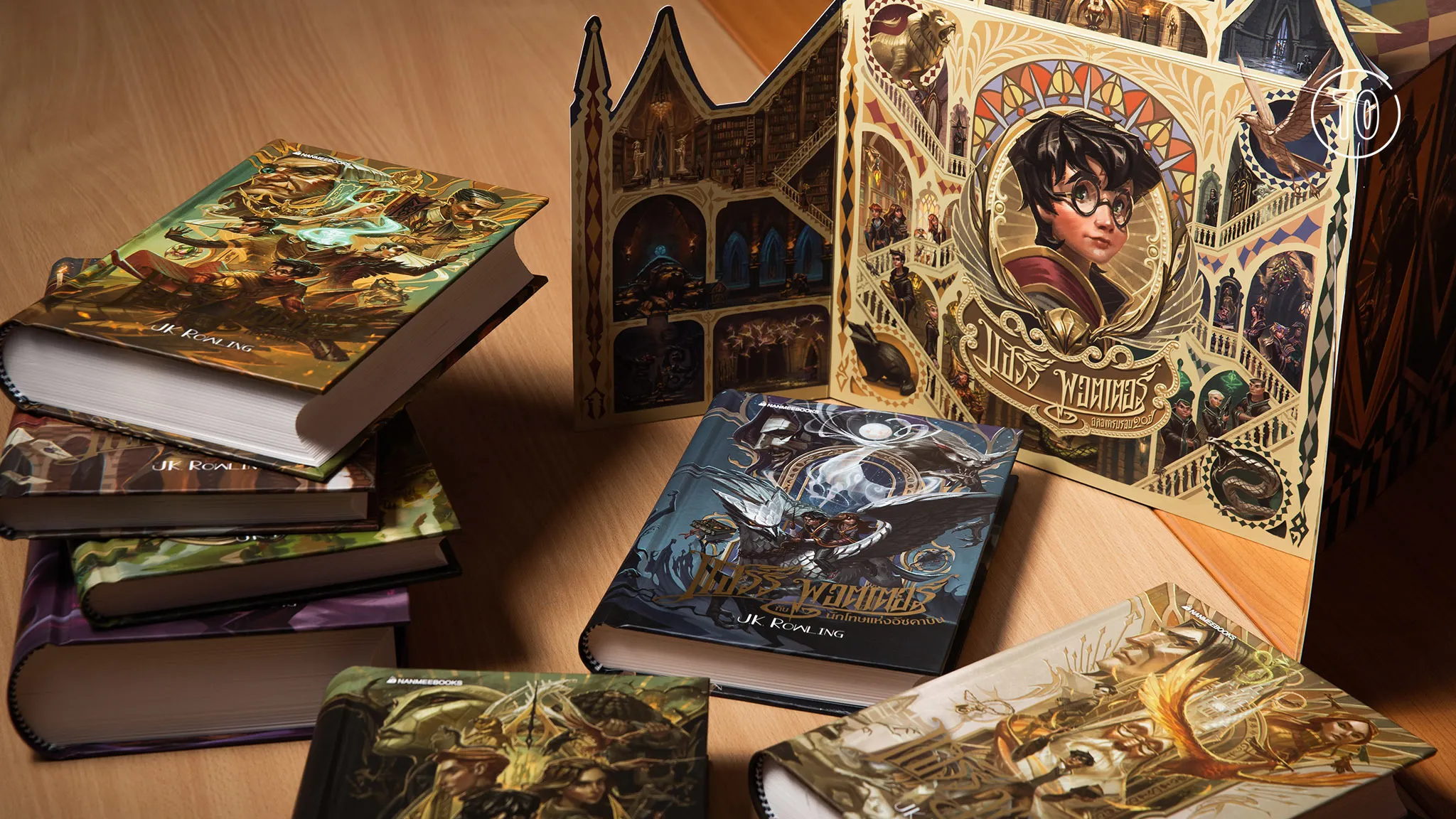
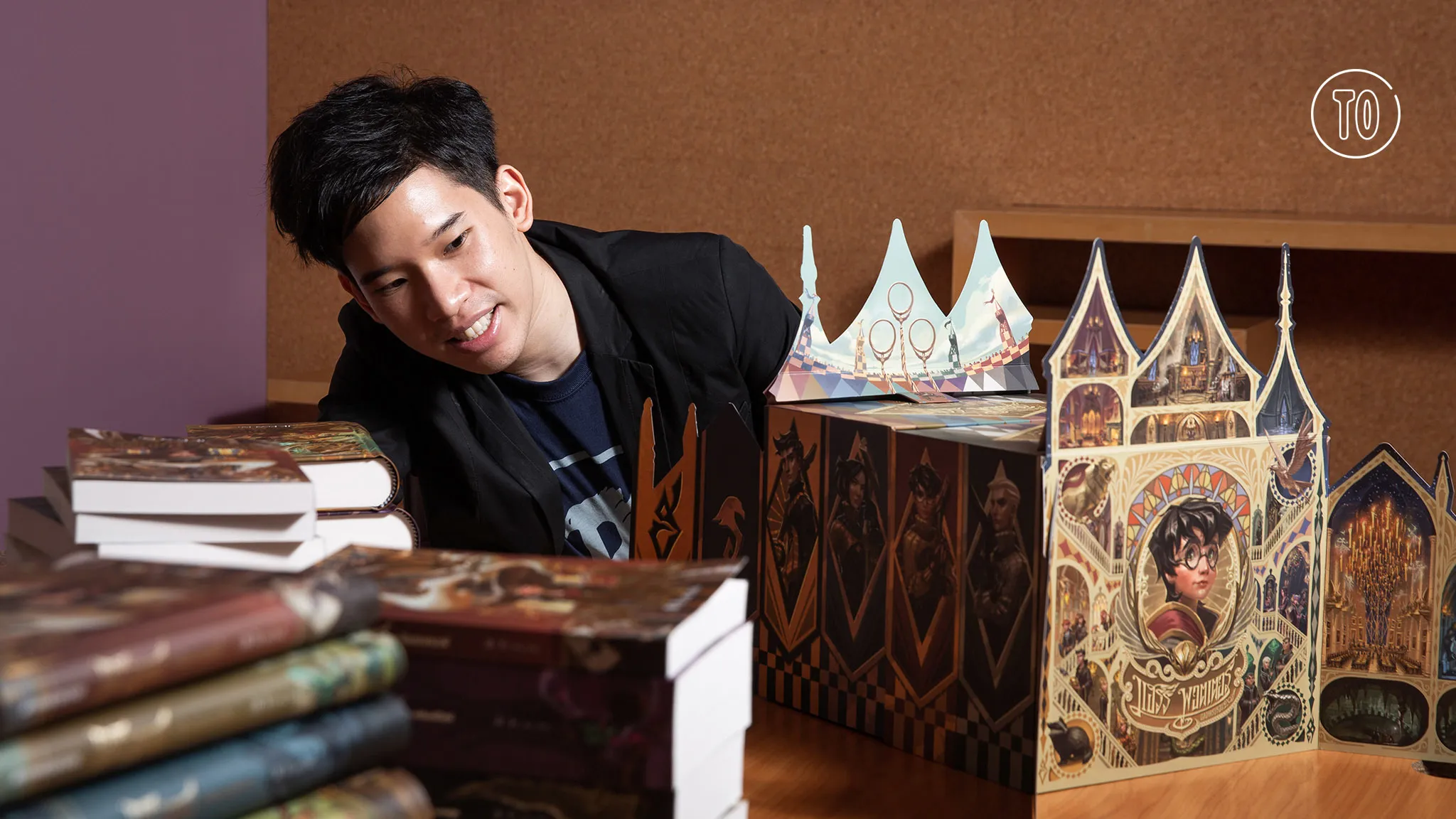
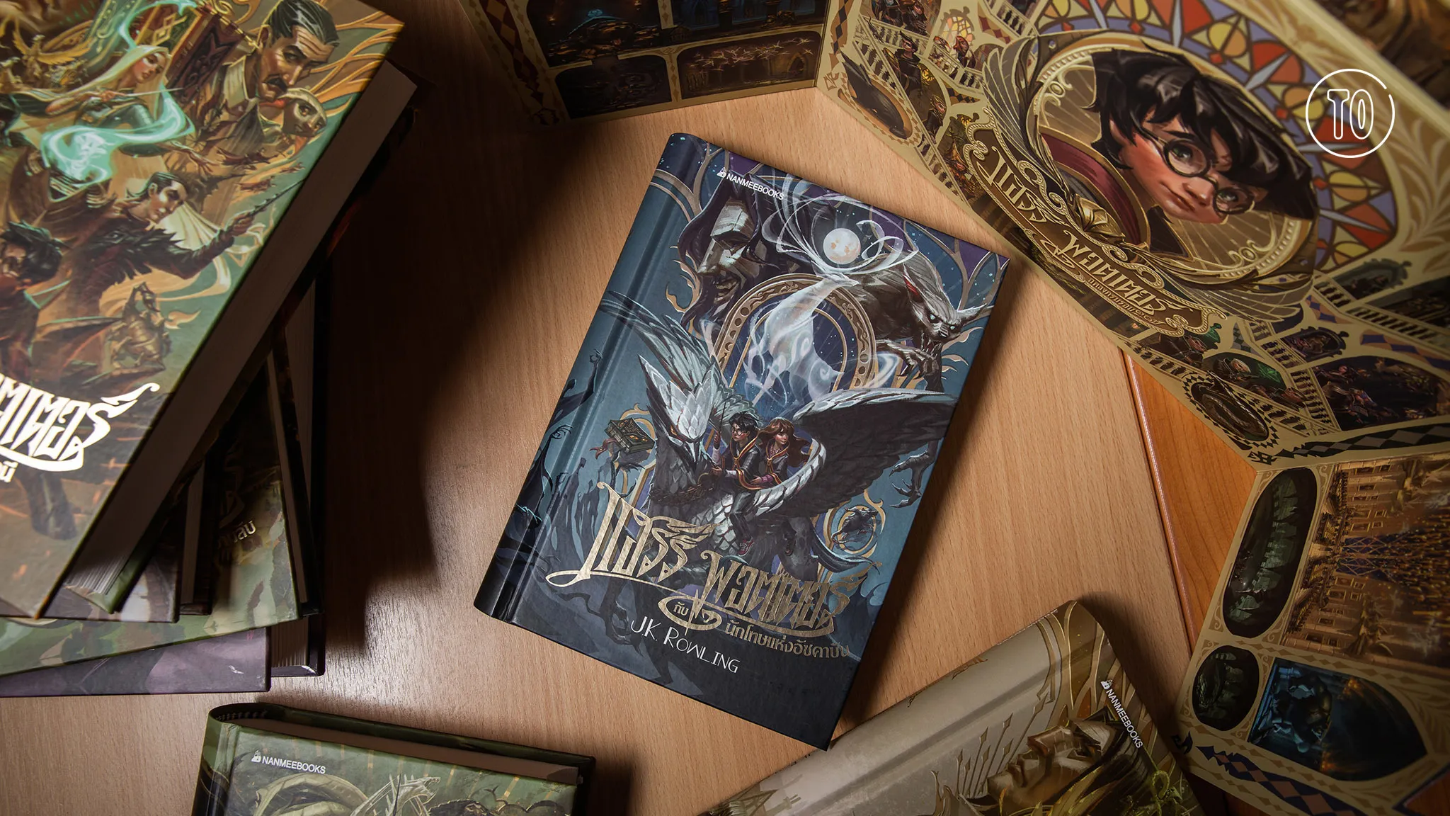
[title]The Thai edition of Harry Potter and the Philosopher’s Stone, the first book in the beloved Harry Potter series, is celebrating its 20th anniversary in July. For this momentous occasion, local publisher Nanmeebooks has released a special edition for all seven Harry Potter books featuring the work of rising Thai artist Arus “Arch” Angchuan aka Apolar.
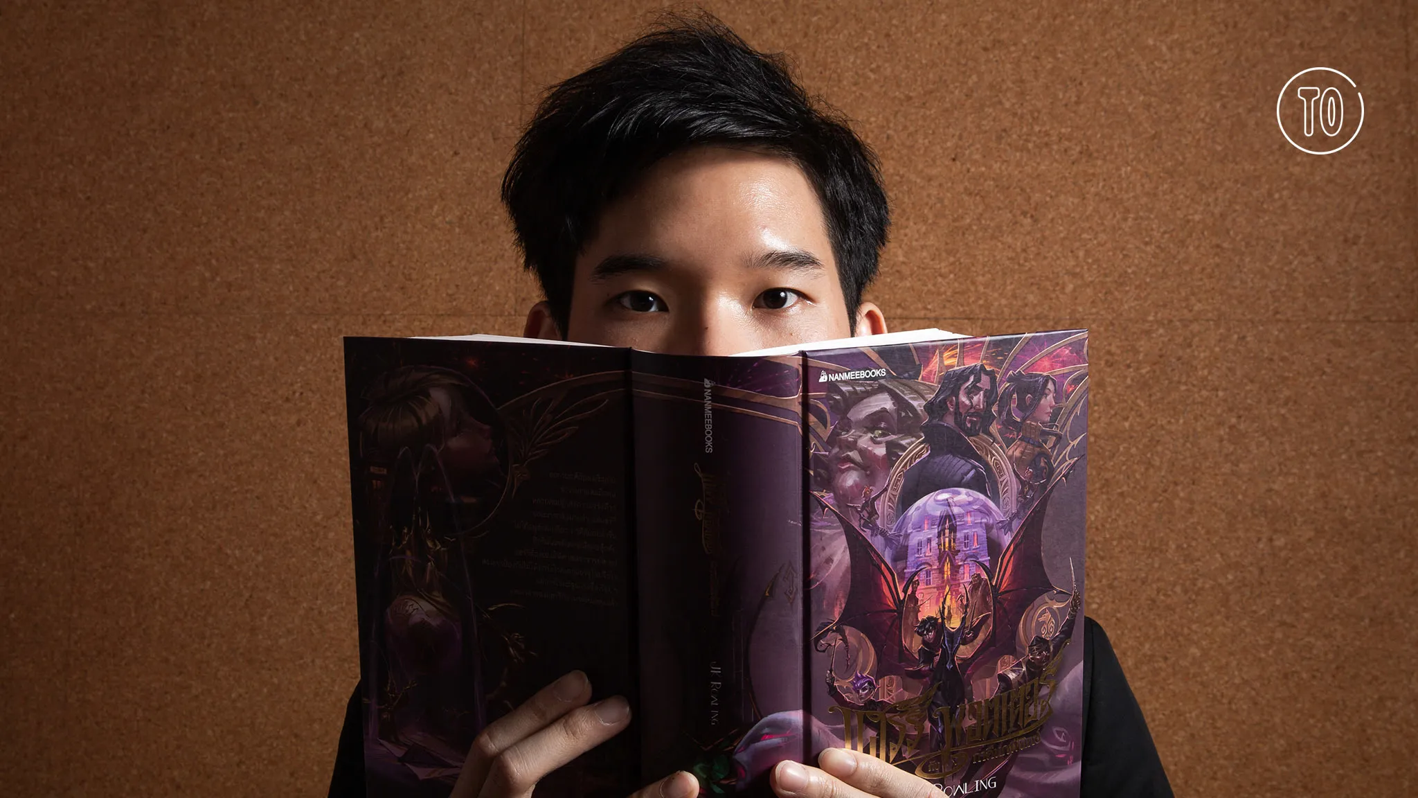
The confessed Potterhead designed all the covers and chapter headers, and provided the illustrations inside the books including stunning full-page images that are only available in this special edition. He also designed the box set as well as souvenir items like postcards and bookmarks.
Time Out sits down with the passionate artist, who is currently working as a freelance conceptual and visual development artist, to talk about his love for the Harry Potter books and how having an architectural background has influenced his artwork.
How did you first get into drawing?
I have always liked to draw since I was young. I was influenced by my dad who’s really into art. I tried sports and a lot of other stuff, but art is what I enjoyed the most. When traveling, I always carried a sketchbook with me. Then it kind of became a habit of mine to draw. When I studied architecture at Chula, I kind of stopped drawing ‘cause the study of architecture focuses more on practical techniques—I did a lot of model-cutting. In my fourth year of college, I met someone who graduated from a really famous university in the States, the graduates of which have gone to work in well-known companies like The Walt Disney Company and Pixar. This opened my eyes to these kinds of schools, and it ignited the idea of going into a different field after I finish my bachelor's in architecture. I wanted to pick up where I left off with drawing and I wanted to discover myself more, so I decided too create a portfolio, which is the most important thing when applying to a college in this field. That’s when I created my Facebook page, Apolar, to post my drawings.
Do you think having a background in architecture has influenced your drawing style and thought process? And how?
Yes, very much. I think I take everything I have encountered in life as a lesson and use it as a tool. The fact that I think everything in a systematical way is because I studied architecture. When you design a building, you have to consider its users, the behavior of humans and their needs, as well as the possibilities of the project, which shows good logic and science. And I think all forms of art can take these elements into account. It stops our thought process from being too muddled. It’s like we have a structure for our thoughts. Before leaving to take my master’s at the Academy of Art University in San Francisco, I was ordained as a monk, and I got to design dharma books. It was a really good challenge as I got to recreate something that’s often considered a book for adults but not for kids. The challenge was how to make the visuals look appealing to kids. It was fun. I think everything that I’ve learned, from studying architecture to when I was ordained as a monk, prepared me for this Harry Potter project.
What was it like going from one field to another?
Like I said, in architecture, you have to consider project possibilities, the budget or structural engineering, but in visual development, you can be as imaginative as you want. Luckily, I have a background in architecture, which helps me hold on to reality and logic, but at the same time, I can still be imaginative and have freedom. I can create a character that you won’t see in real life. It opens up a fantasy world for me, which I really enjoy. There are no limits.
How would you describe the art that you drew for these special-edition books?
There were no real limitations to what I could do, but the images that stuck in my head were those from international editions, like the 20th anniversary American edition and other remade versions from several countries. I saw that they weren’t too cartoony nor very stylized. The Harry Potter books drawn by other artists are somewhere between stylized and realistic. I like the stylized style because I’m personally impressed with Mary GrandPré, the illustrator of the original Thai version. [Her art] is kid-friendly and not too realistic. And I love a balance like this. I wanted my version to also appeal to kids because it was when I was a kid that I read Harry Potter.
At the same time, I also wanted to create details that even adults can enjoy. I also wanted the design to look international, like the works of artists from the early 20th century, the golden era of illustration, when J. C. Leyendecker and Norman Rockwell were really famous—I think the colors they used were really vintage-looking, and the lines were injected with so much craftsmanship. I wanted these books to look like they were designed at a particular time yet still have a timeliness to them. So I did some research on how to play with different textures and added these to the design. I think people can refer to my style as semi-realistic and stylized.
Where did your inspiration come from and what was your thought process like?
I wanted some kind of pattern or structure for the covers for all the books in this edition. This is where I used the architectural thought process because I wanted the design to have some kind of system. So I thought of a window framing a door that opens up to the contents inside the book. When you design things architecturally, you have a plan wherein you divide a space into smaller spaces. And then in these smaller spaces, you can fit even smaller details. People will find tiny details hidden in different parts of my illustrations the more they look at it. Also, every element that I draw connects with one another. The front cover is connected to the back cover, for example. In my experience, I always get good feedback when the front cover has some kind of connection with the back. So I decided to bring back that idea.
What were your other challenges while doing this project?
The characters are not the only important element in the Harry Potter series; the wizarding world that J. K. Rowling created [is also very important]. She describes the details of the castle in such a grand and magical way. In reimagining these details, the challenge was how to make it fun and how to constantly ignite the imagination of readers. From the words that the writer gave, how far can I push the creativity forward?
How is this Thai edition different from other international versions?
I wanted this edition to be a gift to Thai fans. I wanted to create this edition as a Harry Potter fan would. I tried to convey my love for the Harry Potter books by putting my all into the details of my art. The international publisher and Nanmee allowed me to put some Thai elements into the artwork such as Thai characters and Thai numbers. At first, I was worried that people would not like it since this is a foreign book but, in the end, we figured out how to incorporate them. For example, in the cover of the first book Harry Potter and the Philosopher's Stone, Platform 9 3/4 was redesigned to reflect a Thai number: ๙ ๓/๔. I feel like since it’s a Thai edition, there should be some Thainess to it.
What feelings are you trying to evoke through your work?
I want the readers to feel that I care about them. When they pick up the book, I want them to feel that the artist or even the team behind these new editions love the Harry Potter books as much as they do. I don’t want to have to go on telling them how much I love the book; I want this love to resonate through my art. All the tiny details that I’ve put in, not only in the covers but also in the full-page images, will tell people that I’ve really read the books. Each element tells a story by itself. Like in the scene in Harry Potter and the Deathly Hallows when Dobby drops a chandelier onto Bellatrix to save Harry, you can see the faces of the characters in the scene on each piece of shattered glass. There’s Draco Malfoy covering his face in pain, Narcissa looking at Draco in worry, Bellatrix with a furious expression on her face, and the passed-out Hermione. I tried to put as many details as I could to show the readers that the artist really gave it his all because he knows how much everyone loves the book.
The hardcover box sets are priced at B4,950, while the paperback box sets are B3,950. Fans can order the books via nanmeebooks.com.