[category]
[title]
The design represented the agency from 1975 to 1992.


Although the National Aeronautics and Space Administration's (NASA) current "meatball" logo is undoubtedly sleek and beautifully designed, folks around the country will never forget the "worm" logo that debuted back in 1975 and represented the agency through 1992. That recognizable design is now making a comeback.
The return of the worm is connected to the launch of SpaceX Falcon 9, which is scheduled to be sent off some time in May from Cape Canaveral in Florida. It will be the first mission to carry astronauts to the International Space Station from American soil since 2011.
Although we've recently been focusing on NASA's exciting new discoveries and virtual tours—not to mention employees' super cool work-from-home setups and accessible space-related tools—we thought this would be the ideal time to sit back, relax and revisit the rather tumultuous history of the American agency's revered logo.
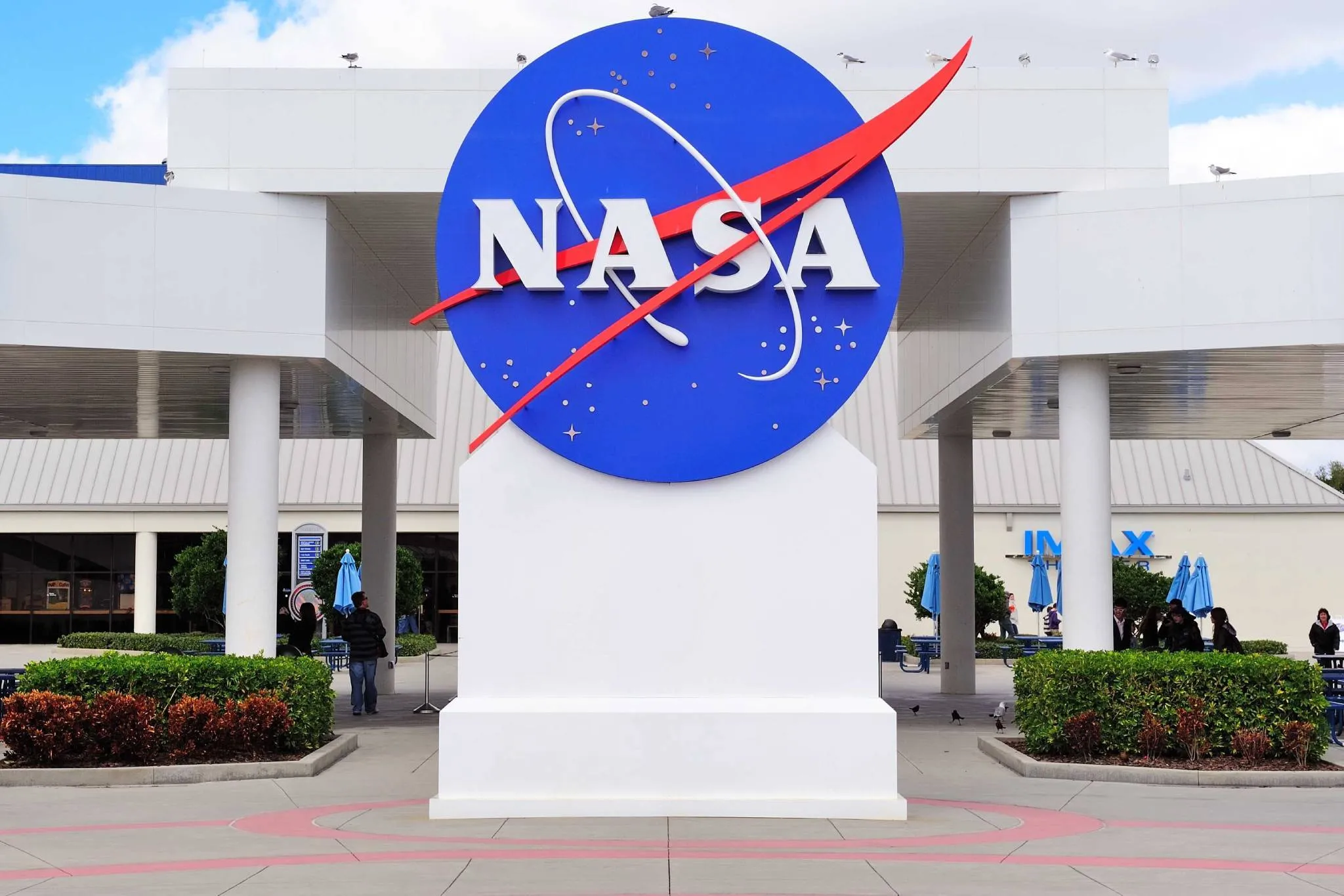
The two most recognizable designs—one nicknamed the meatball and the other the worm—couldn't be more different from each other. The former, which, ironically, looks most "modern," was actually introduced first, just a year after the agency was set up. It was replaced by the worm in 1975, under orders by former President Richard Nixon, who requested a wider revamping of graphics across a slew of government programs.
The change wasn't appreciated by employees. "Many found out the old logo was being obliterated when new letterhead paper was shipped to them from headquarters, with no further explanations," NASA's chief historian, Bill Barry, told CNN. "People were just incensed."
Bruce Blackburn and Richard Dannen, founders of a then-new New York firm, designed the worm—a nickname that, it must be noted, was meant to be disparaging in nature.
In 1992, Daniel Goldin became the new NASA administrator and, thinking it would boost morale across the agency, he decided to revive the old logo, which represented the program during the United States' very first moon landing. Rumor has it that Goldin himself absolutely hated the worm, trying to find ways to make a return to the meatball design as soon as he was appointed to NASA.
Funnily enough, although the meatball became the official symbol of the agency, the worm never disappeared: it is still found on souvenir items and it's carved into granite inside NASA headquarters.
That all brings us to today, an era of mixed views when it comes to NASA logos. Earlier this month, the agency's current administrator, Jim Bridenstine, announced the return of the worm in connection to the latest expedition, a piece of news that was met with much fanfare (Bridenstine himself seems to be a big fan) and bewilderment. We're personally just excited about the launch of SpaceX, no matter what logo the astronauts will be blasting off under.
Discover Time Out original video