Frank Stella looks back on 55 years of making art

One of America's most important artists of the last 60 years gets a retrospective at the Whitney Museum of American Art

Advertising

The youngest artist to ever receive a retrospective at the Museum of Modern Art—in 1970, at age 34—Frank Stella carved his name into American art history with his innovative shaped canvases. They collapsed the distinction between painting and sculpture by reminding viewers that paintings start as three-dimensional objects. Obvious now, perhaps, but not in 1959, when Stella created his iconic “Black Paintings.” They paved the way for Minimalism, while subsequent works—the “Irregular Polygons” and “Indian Bird” series, to name two—gave painting a radical new twist. With a Whitney Museum retrospective opening this fall, the 79-year-old artist weighs in on his groundbreaking work and his continuing experimentation with materials and forms.

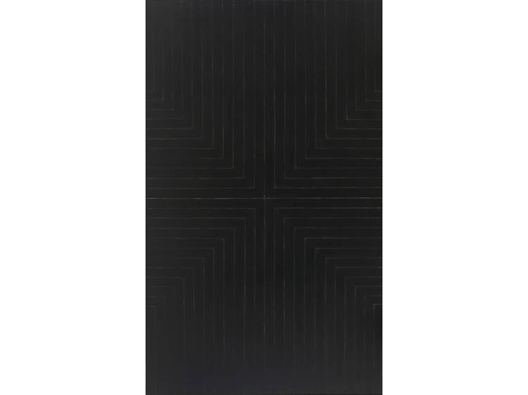
Die Fahne hoch! (1959), “Black Paintings” series

“Out of frustration with some previous works I’d made using combinations of black, yellow and red stripes, I started making symmetrical paintings with all-black bands that radiated in concentric patterns from the center of the composition. I used black enamel on raw canvas because I liked the way the paint was absorbed by the cotton duck—and it was cheap! I was reacting to Abstract Expressionism which, by the time I arrived, meant second-generation artists giving painterly abstraction a bad name.”

Avicenna (1960), “Aluminum Paintings” series

“I made my biggest jump with the ‘Aluminum Paintings.’ They were similar to the ‘Black Paintings,’ which preceded them, but I used metallic paint instead of black, which made the surface flat and nonillusionistic. It’s also called radiator paint, so if I wanted to be cute about it, I’d say that I was making industrial-strength paintings. They were the first with which I felt I was doing something different.”

Advertising

Jasper’s Dilemma (1962), “Mitered Maze” series

Jasper’s Dilemma is a diptych where one canvas uses a color scale and the other a gray scale. The title refers to Jasper Johns’s switch from color to grisaille in a series of his own works at the time. I found it hard to resist my own version. On the colored panel, I used Benjamin Moore paint straight out of the can, mixing it in only the most basic ways, by adding, say, blue to red to make purple.”

Chocorua IV (1966), “Irregular Polygons” series

“The titles of the 'Irregular Polygons' refer to spots in New Hampshire where my father and I went fishing. They were inspired by Kazimir Malevich’s painting, which depicts a black vertical rectangle with a blue triangle stuck into its left side. Chocorua IV uses a similar idea but without the same vestige of depth. The pictorial plane here is ambiguous, with bands of color moving around the shapes.” 

Advertising

Harran II (1967), “Protractor” series

“The movement in Chocorua IV became more obvious in the ‘Protractor’ paintings that followed. I also mixed regular paints with fluorescent paints to get a wider range of colors, which I alternated for contrast, instead of following some sort of color theory. Because of the contoured shapes, I had to have the stretchers custom-built, which was difficult, but not impossible. I made the paintings monumental because making them smaller didn’t make much sense to me.”

Chodorow II (1971), “Polish Village” series

“I was given a book about the Polish wooden synagogues that were destroyed by the Nazis during World War II. There were photos of them from before the war, and their structure interested me because of the way that parts interlocked. So I built these paintings in layers, kind of like carpentry, using felt, paper, canvas and wood like you would in a collage, only in a more geometrical pattern. Looking back, they seem more like architecture to me than they did when I made them.”

Advertising

Khar-pidda 5.5x (1978), “Indian Bird” series

“I was in India, when I began these paintings. Each background was like a cage—a birdcage. The work was more sculptural than my previous paintings, with forms sticking out from the wall, so I had to build an armature to support them. I used shapes like French curves, working on them separately, then put them together to see how they fit, which they did pretty well.”

Talladega (1980), “Circuit” series

“In 1976, I began this project for BMW, in which I designed the exterior of a race car, and in the middle of all that, I started going around the racing circuit, visiting racetracks, which inspired the shapes and sense of motion in the ‘Circuit’ paintings. I approached them by pushing the techniques I introduced in the ‘Indian Bird’ series. In Talladega, for instance, I complicated its compositional space by stacking dense layers of cutout forms, one on top of the another, while mixing rectilinear shapes with irregular ones.” 

Advertising

Gobba, zoppa e collotorto (1985), “Cones and Columns” series

“These painting were inspired by the writings of Italo Calvino. I borrowed images of cones and columns from a 17th century stonecutting manual. In a way, I thought they look like figures or actors enacting some sort of narrative. The works are a bit confusing because the shapes look three-dimensional, but they’re actually flat.”

The Whiteness of the Whale (IRS-1, 2X) (1987), “Moby Dick” series

“The idea for these paintings came from a trip to the New York Aquarium, where I saw a couple of beluga whales in a tank. I had grown up on the water in Ipswich, Massachusetts, and I couldn’t stop thinking about them, which made me begin to think about Moby Dick which, from my point of view, is about going around the world to get where you already are. The idea of using a wave came to me. When a surface is waved, it creates a different kind of geometry: You have to start thinking about it topologically, as opposed to using rectangles, which are flat.”

Advertising

Raft of the Medusa (Part I) (1990), “Poured Aluminum” series

“I was trying to move away from Moby Dick with these paintings, yet still refer to water, somehow. I used an old technique of making shaped depressions in a sand pit, then pouring molten aluminum into it. The result looked so painterly by themselves that I left them unpainted. It almost seems like a joke, making sculptures that are painterly, but it happened without me really thinking about it.”

redjang (2009), “Bali” series 

“For the titles of these pieces, I referred to Margaret Mead’s and Gregory Bateson’s studies of the Balinese. This piece incorporates wavy pieces of fiberglass on a structure of metal tubing that look like lines from a drawing. The fiberglass parts look like sails on the horizon of Bali. A similar series, which I call ‘Scarlatti K,’ is made with 3-D printing. I’ve been using digital processes for about 20 years now, because they’re the only way you can get something built these days.”

See the exhibition

Recommended
    You may also like
    You may also like
    Advertising