

[title]
This weekend, the cost of riding the tube is going up. Of course, as soon as prices are hiked up, it’s easy for everyone to be up in arms about it. But what if we told you that, when you take inflation into account, central London tube fares are pretty much the same as they were two decades ago? And, in real terms, the daily cap on fares is actually cheaper now than when it was first introduced.
Researchers at Tube Alerter have dug into 21 years of Mayoral Decision documents and TfL press releases to track just how much tube fares have changed in that time.
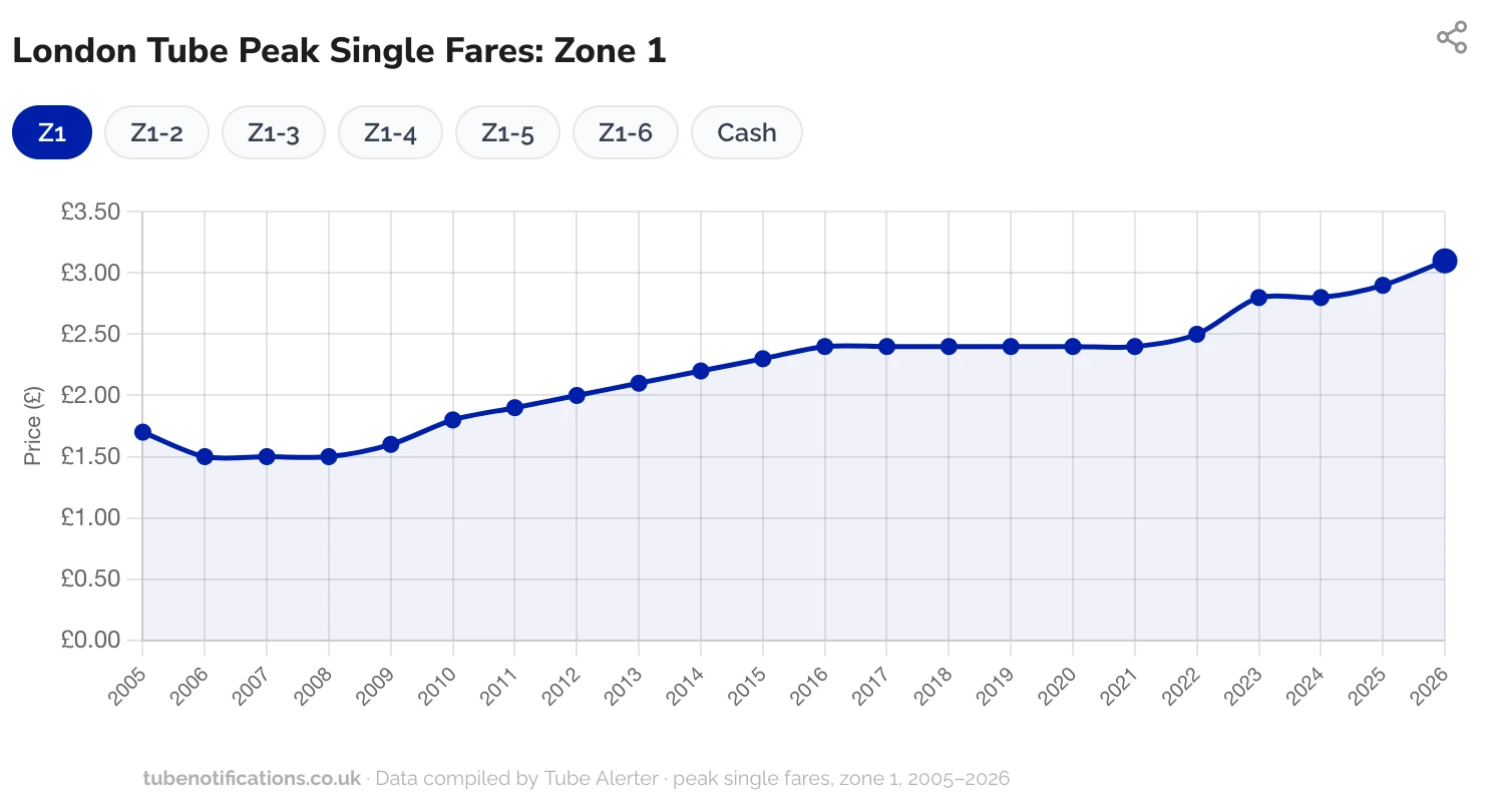
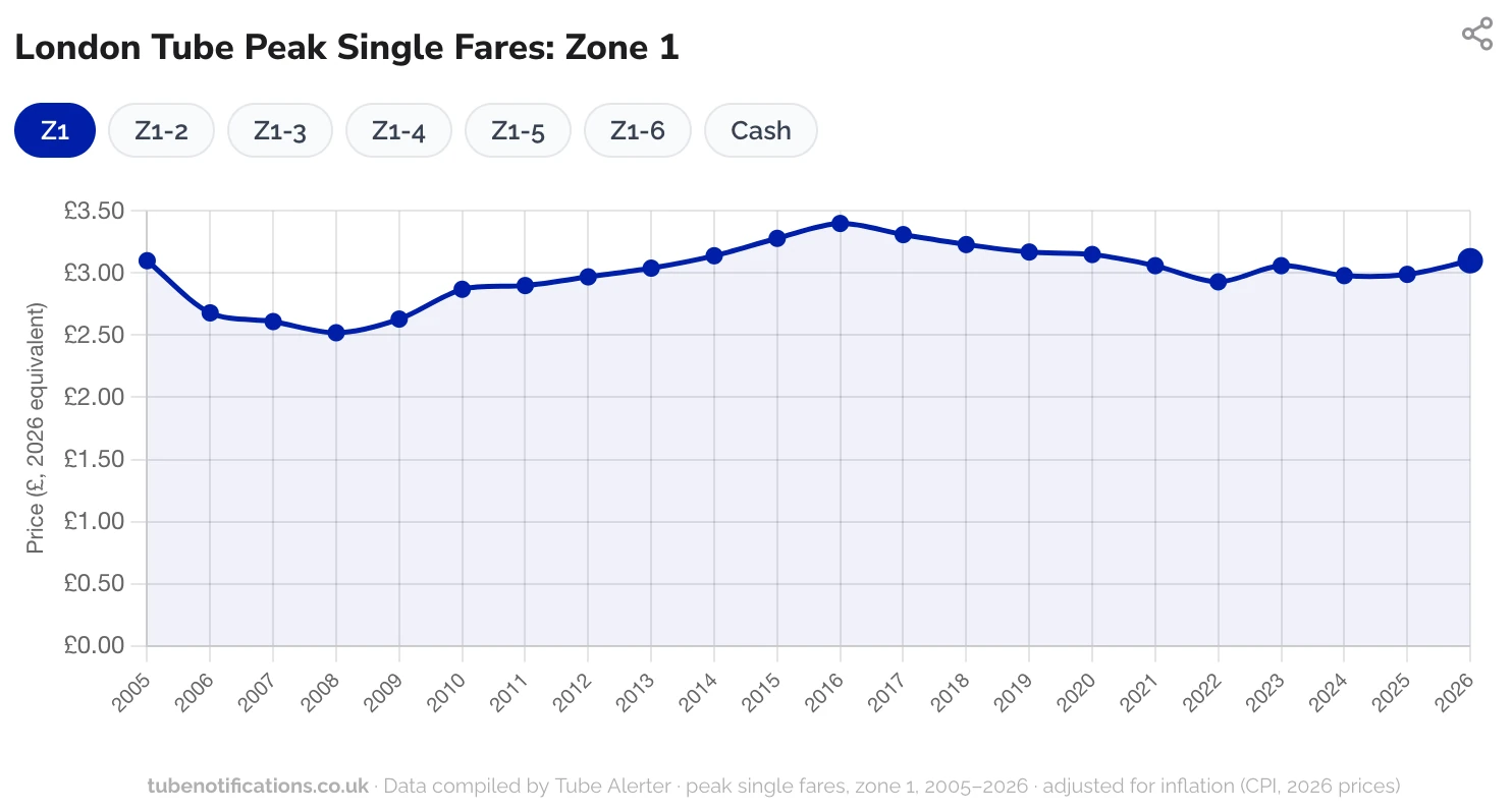
The data covers every tube zone from 2005 (when the Oyster daily capping was first introduced) to 2026. In that time, a Zone 1 peak single fare has risen by 82 percent from £1.70 to £3.10. That might sound like a staggering increase, but when you adjust for inflation, those prices are roughly the same in real terms. The same goes for Zone 1 to Zone 2 and Zone 1 to Zone 3 fares.
And while daily caps have risen – £5.20 for Zone 1 to Zone 2 in 2005 versus £8.90 in 2026 – they’ve actually decreased when you adjust for inflation. By today’s money, the 2005 cap was £9.67.
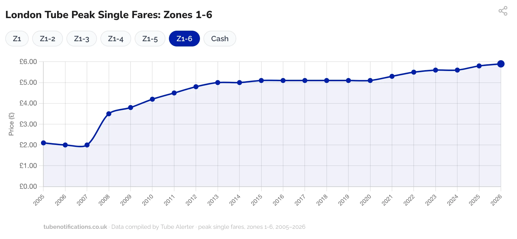
However, when you look at Zone 1 to Zone 6 peak single fares, there is more of a gap in real terms. These days that journey costs £5.60 but back in 2005 it was £2.10 which, adjusting for inflation, is equivalent to £3.83. That means that travelling in and out of London’s outer zone is 54 percent more expensive in real terms today compared to 20 years ago.
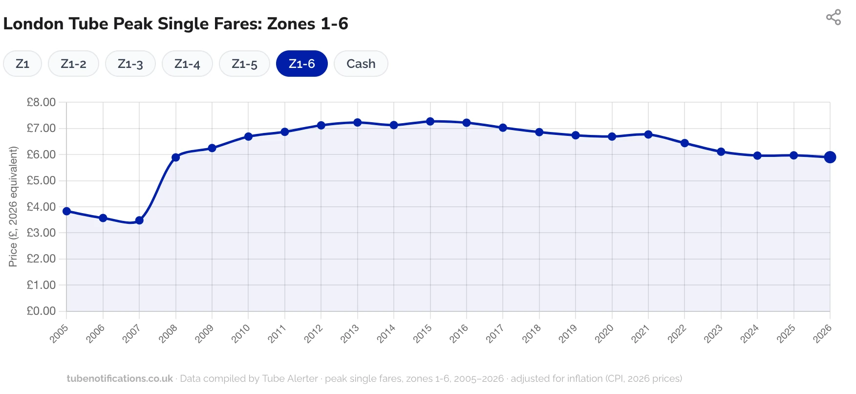
The charts show that tube fares are actually cheaper right now in real terms than they were during the years that Boris Johnson was mayor. Tube fares to Zone 1 to Zone 2 travel were at their least most expensive in relation to inflation between 2013 and 2015 when a peak single cost £4 in today’s money. According to Tube Alerter, 2015 was when the fares hit peak unaffordability – rebased to today's median salary, the £2.90 Zone 1-2 fare was equivalent to £4.38, which is 22 percent more than the £3.60 that Londoners pay today.
You can explore the interactive tube fare tracker in more detail here.
ICYMI: You can get free rides on three London bus routes for the next three months.
Plus: This major London airport is finally getting contactless payments for train tickets next month.
Get the latest and greatest from the Big Smoke – from news and reviews to events and trends. Just follow our Time Out London WhatsApp channel.
Stay in the loop: sign up to our free Time Out London newsletter for the best of the city, straight to your inbox.