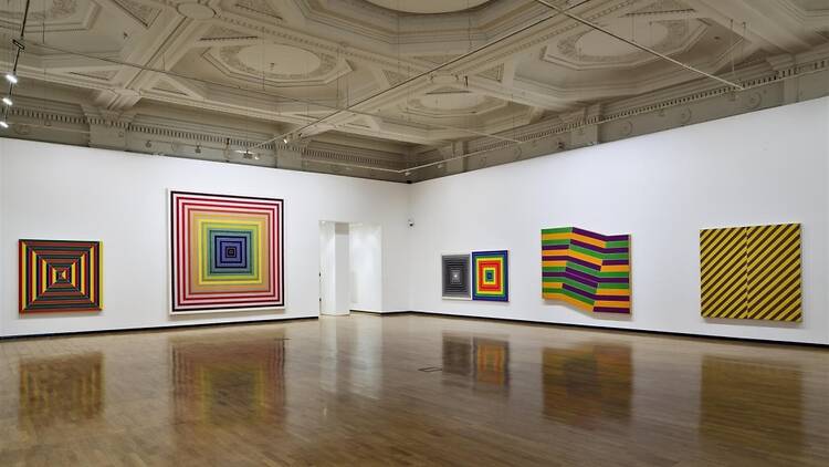
In the run-up to Frieze week, galleries inevitably bring out their big guns – and you don’t get much bigger than Frank Stella, one of the originators of minimalism, with his iconic black, ‘pin-stripe’ paintings of the late ’50s. None of which, rather surprisingly, are actually exhibited here. For this isn’t a retrospective, so much as a ‘thematic selection’ – or, to put it another way, a clear-out of Stella’s studio, along with a few judicious loans.
There are some fascinating early pieces – also black and stripy, but from when Stella was still beholden to a more slapdash, abstract expressionist style. Also are a few works from his minimalist and colour-field heydays: canvasses in regular or irregular shapes, their edges objectively determining the arrangement of stripes, so that only the colour-scheme – drably monochrome at first, later dazzlingly varied – was up to Stella’s discretion. But for the majority of the exhibition, the focus is on his lesser-known works from the ’70s onwards, when he began to expand this notion of painting-as-object, creating elaborate, multicoloured, semi-sculptural wall-works.
Most of them are fantastic: interlocking planes and overlapping surfaces that seem to twist and separate, as if about to explosively prise apart; or the whirl of historical quotations and representational games that characterise his metal reliefs from the ’80s. The continual sense is of a determined brinkmanship, of barely managing to keep all these disparate, autonomous elements corralled and contained – a kind of frenetic maximalism, then, as opposed to minimalism.
Yet the thematic (instead of strictly chronological) hang shows the endurance of his basic concerns: surface, colour, allegory. Only the computerish, vaguely biotech forms of the last decade are disappointing – somewhat sinister when made into sculptures, admittedly. But, as canvasses full of swirling colours and designs, they feel a bit too much like postmodern clichés.
