
[title]
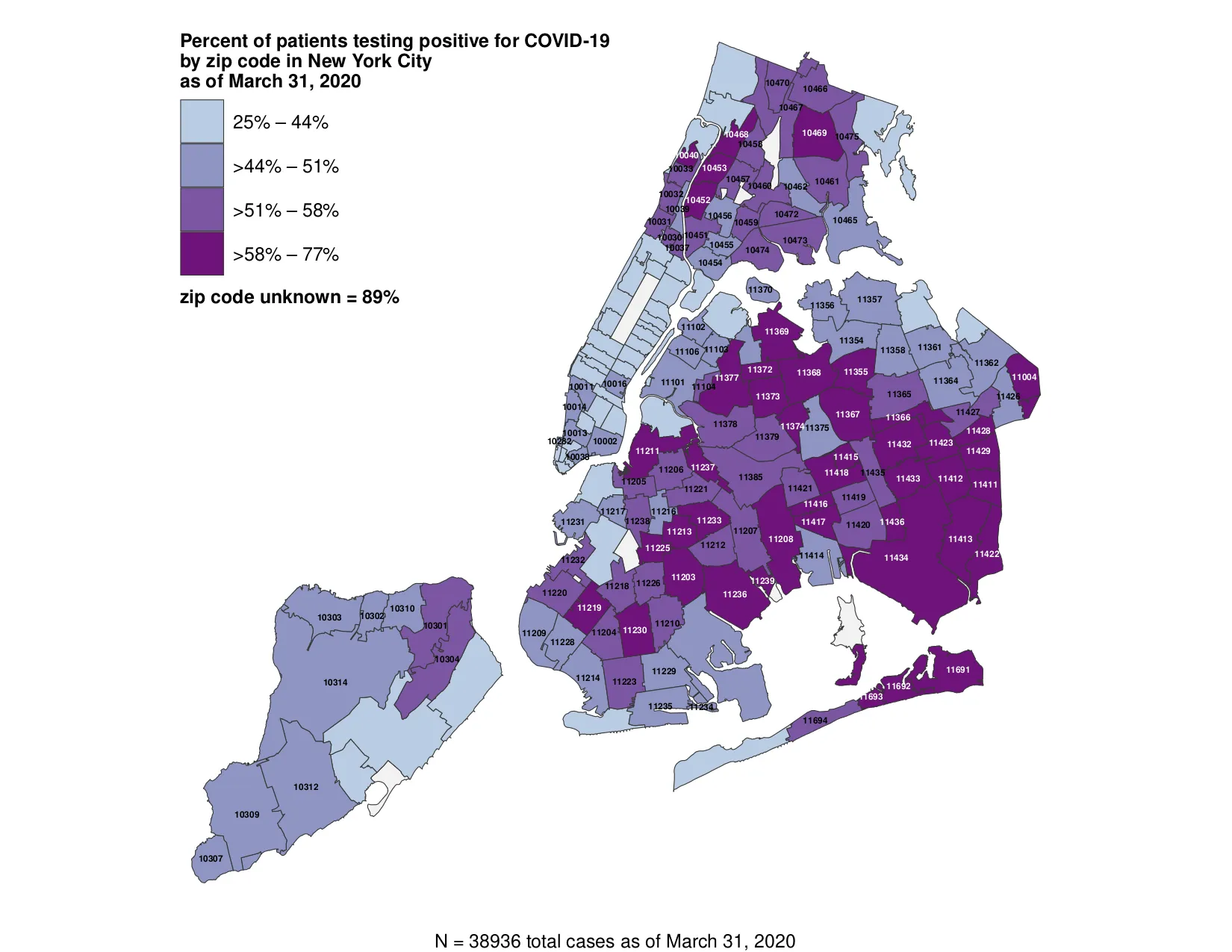
Last week, the New York City Department of Health released a heat-map of the Five Boroughs showing coronavirus cases by neighborhood. Today, they've released another map based on a more detailed metric. The new map shows the percentage of patients across the city who have tested positive for Covid-19 as of March 31 according to zip code. It illustrates a grim, if unsurprising, fact about the coronavirus pandemic: That it is hitting poor people much harder than rich ones.
Though it omits the overall number of tests administered, the new map is clear enough in its finding that the city's wealthiest neighborhoods—Manhattan and the areas of Brooklyn and Queens near the waterfront—have the lowest percentage of positive test results compared to outer-borough Brooklyn and Queens. (Staten Island also has a relatively low percentage of Covid-19 cases.) Indeed, the map shows that positive rates in communities like Jamaica, Queens and Brownsville, Brooklyn range from 58% to 77%, while both the Upper East Side and the Upper West Side max out at 44%.
Both last week's maps and this one were issued after protests over the lack of transparency on the number of NYC coronavirus cases from Mayor Bill De Blasio, who’s been otherwise busy imposing fines or removing basketball hoops from city parks to rein in social distancing scofflaws. And if you’re still not sure about the dos and don’ts of living under lockdown in New York, you can find all that you need to know here.
Credit: NYC Department of Health