
[title]

Click for the full-sized map
Trying to save up enough money to put down a deposit on a house in London? Yeah, good luck with that, pal.
The folks at online estate agent Emoov have put together this handy (and horribly depressing) tube map, which shows the average house price for each of the 280 tube stops on the London Underground.
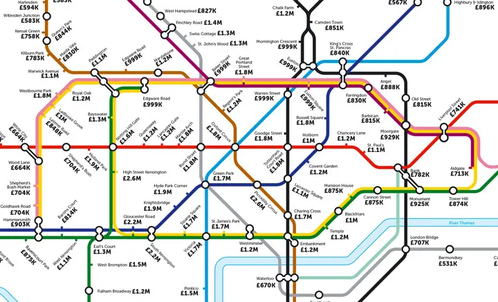
If you've got a casual £2.6 million kicking around then you can snap up a house in Piccadilly Circus or High Street Kensington. But at the other end of the spectrum – and way out at the other end of the line – things are slightly less ridiculous, with the lowest average house price coming in at £292,000, although that would mean living in Hatton Cross in Zone 5/6. But hey, at least you'd be close to Heathrow for all those holidays you'll go one once you've spent all your money on a house.
Not ready to get on the property ladder? This tube map shows average rent costs near every Underground station.
Or use this handy map to find out how much it costs to rent a single desk in London.
And could this alternative tube map be easier to understand than TfL's version?