[category]
[title]
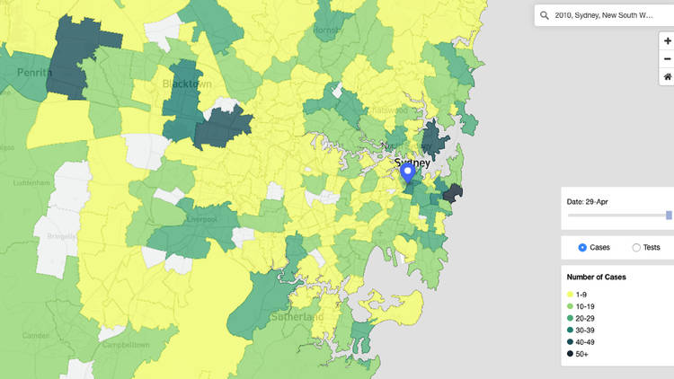
You can search your area to find out how many active cases are nearby.

NSW Health has launched a new interactive online ‘heat map’ showing the infection hotspots around the state. The map allows a user to see in real-time the current status of every postcode across NSW, including the number of active cases, the cumulative total of people diagnosed, and how many people have now recovered.
Each region is colour coded, representing how many cases there have been. Currently, Bondi is the most infected suburb in the state with 112 cases, followed by Mosman with 41 cases.
The map also includes a date filter, so you can see how the disease has spread through communities over time since March 25, as well as data on how many locals in any given area have been tested.
NSW still has the highest number of cases anywhere in the country, with 3,016 people diagnosed to date. Of that number, 690 cases are still active. Despite this high number, containment efforts in the state have resulted in a steep decline of new cases in recent weeks, while the number of people being tested daily has greatly increased, to between 7,000 and 8,000 screenings per day.
From May 1, the state has begun rolling back some social restrictions, including allowing retailers to reopen and a maximum of two adults to visit another household for social reasons.
Discover Time Out original video