[title]
Nearly 5,000 people have signed a petition asking for Imperial College to change its new logo. What’s so offensive about it? You might be wondering. Perhaps it accidentally looks like something obscene? Or is just plain ugly?
It turns out, people don’t like the new Imperial logo because it’s too simple. It may be ranked the sixth-best university in the world, but Imperial’s graphic design skills are something to be desired.
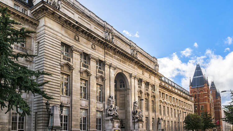
The logo, which features ‘Imperial’ written in capitals using a bold, white typeface on a plain royal blue background, was unveiled on Imperial’s South Kensington campus earlier this month.
Imperial College London has faced criticism over a planned rebrand seen as emphasising “pejorative historical connotations”, with almost 3,000 people signing a petition against the new logo.https://t.co/Oi7rBC2ayO
— Times Higher Education (@timeshighered) February 26, 2024
In June 2023 Imperial sent emails to all students asking them to complete a survey and attend focus groups regarding the new logo which was being developed, receiving 350 responses. But now, the students aren't happy.
Student Anaya Jaffer created the ‘Stop the Imperial College logo’ after the new sign was mocked and became the subject of several memes. According to the online petition, ‘many (if not most) students dislike the new logo; the new colour and font look almost cartoonish and it is not a good representation of the college’.
‘I wasn’t sure if it was real at first,’ Jaffer told Imperial's student newspaper Felix. ‘I was speaking to more and more people about it and realised that everyone shared this strong dislike. When I saw Imperial was already starting to put it up, I realised it’s actually happening – if we don’t want it to happen, we’d better do something now.
‘On the website, it said they had 350 survey responses and over 1,600 video views, which really isn’t that much considering there are around 30,000 staff and students here.’
Other students complained that the dropping of ‘College London’ from the title of the university had too many connotations of imperialism.
An Imperial College spokesperson said: ‘The team will take any opportunity to hear what people think, to listen, and to answer questions.’
It added that it was ‘absolutely determined to develop a brand identity that serves the whole community.’
What do you think? Should Imperial change its logo, or blithely go on?
Imperial College and Time Out
In more positive news, we at Time Out recently covered how Imperial was the only London uni to make the top ten in Times Higher Education’s ranking of the best universities in the world. The institution was also named one of the UK’s best unis by the Sunday Times.
ICYMI: Eight of the world’s best schools are in London.
Plus: Two famous London universities are merging.
Listen to Time Out’s brilliant podcast ‘Love Thy Neighbourhood’: the newest episode with Paul Foot in Fitzrovia is out now.
Stay in the loop: sign up to our free Time Out London newsletter for the best of the city, straight to your inbox.

