[category]
[title]
Using web scrapers and Tableau, Arizona-based data geek Rajeshwar Nitiyanandan made a chart of major L.A. KBBQ restaurants by price and starred ratings.


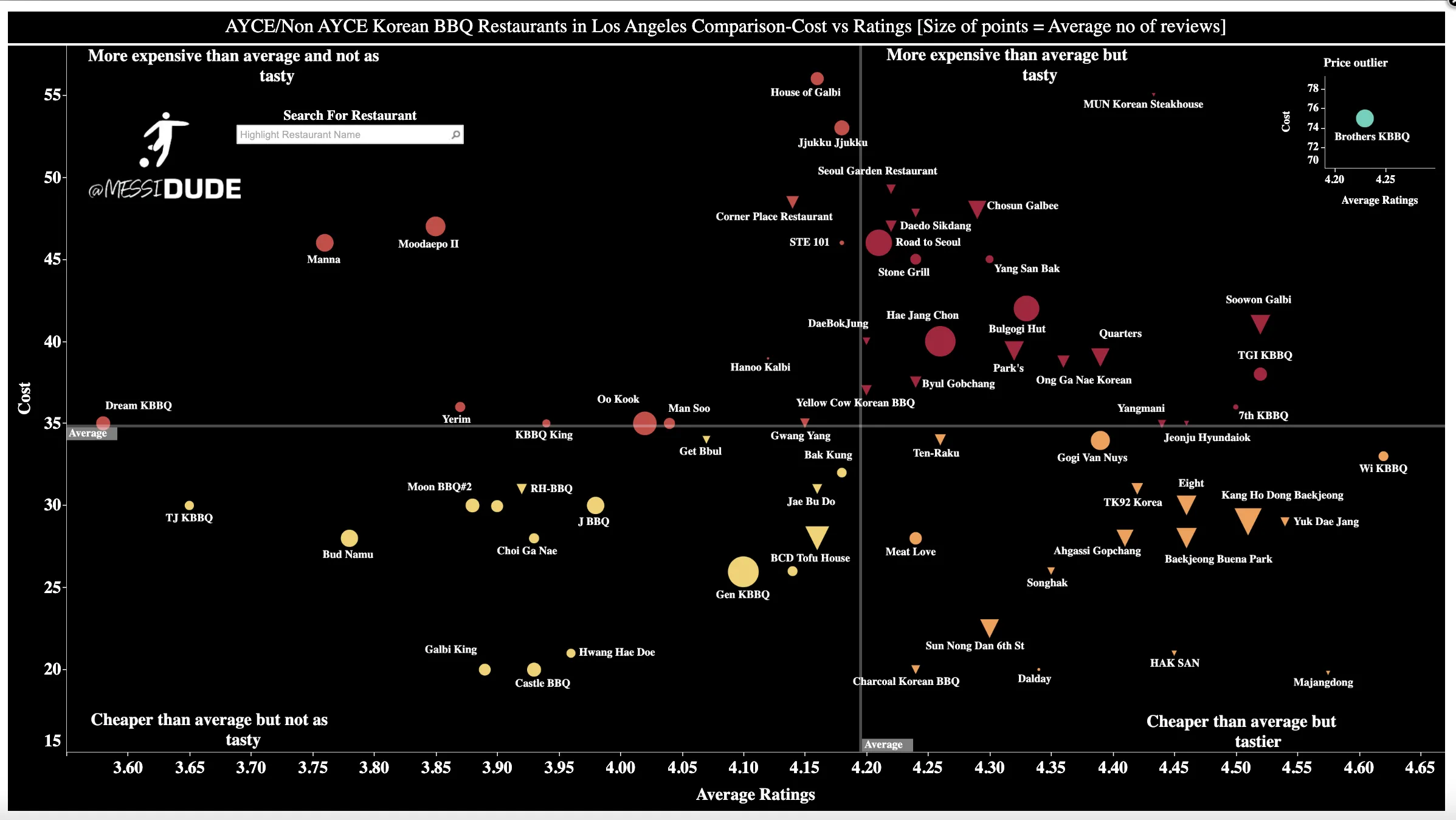
Well, here’s something fun for the left-brained among us: a graphed data visualization of over 70 Los Angeles Korean barbecue restaurants ranked by cost and popularity, courtesy of one grilled meat-loving cancer biologist in Tempe, Arizona. While by no means comprehensive, the user-generated review-based chart displays the glorious diversity of options in L.A.’s Korean barbecue, all in one handy-dandy diagram (h/t to L.A. TACO).
Although the chart’s author, Rajeshwar Nitiyanandan, hasn’t lived in L.A. full-time since 2015, the Arizona State University cancer biology PhD student—who goes by Rajesh—still hasn’t forgotten the beauty of the city’s diverse Korean barbecue scene. Since moving to Tempe for his degree, Rajesh has made sure to make time to return to the City of Angels, where his love of grilled meat first began at the now-closed all-you-can-eat Castle BBQ. He recently channeled his dining knowledge into his Los Angeles-specific food data visualization published in early February, one of a series of food and soccer data-based Tableau charts Rajesh first began making in quarantine (full size here).
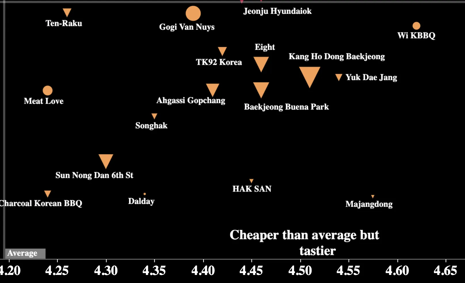
According to Rajesh’s graph, the clear Korean barbecue winners in terms of price and quality were Wi BBQ, Yuk Dae Jang and Kang Hodong Baekjeong, with the restaurant’s Buena Park location not far behind.
Setting his data parameters to all Korean barbecue restaurants in L.A. County, Rajesh came up with a list of over 70 spots, with most in Koreatown but a few elsewhere. To measure ratings-based popularity, he used a Python scraper to filter through Yelp, Google Reviews and other crowdsourced starred review platforms for the restaurants' average ratings. The cost side on the Y-axis reflects up-to-date AYCE per person menu prices. For non-AYCE restaurants, Rajesh took the most expensive meats combo and divided them by the suggested number of guests the item could feed.
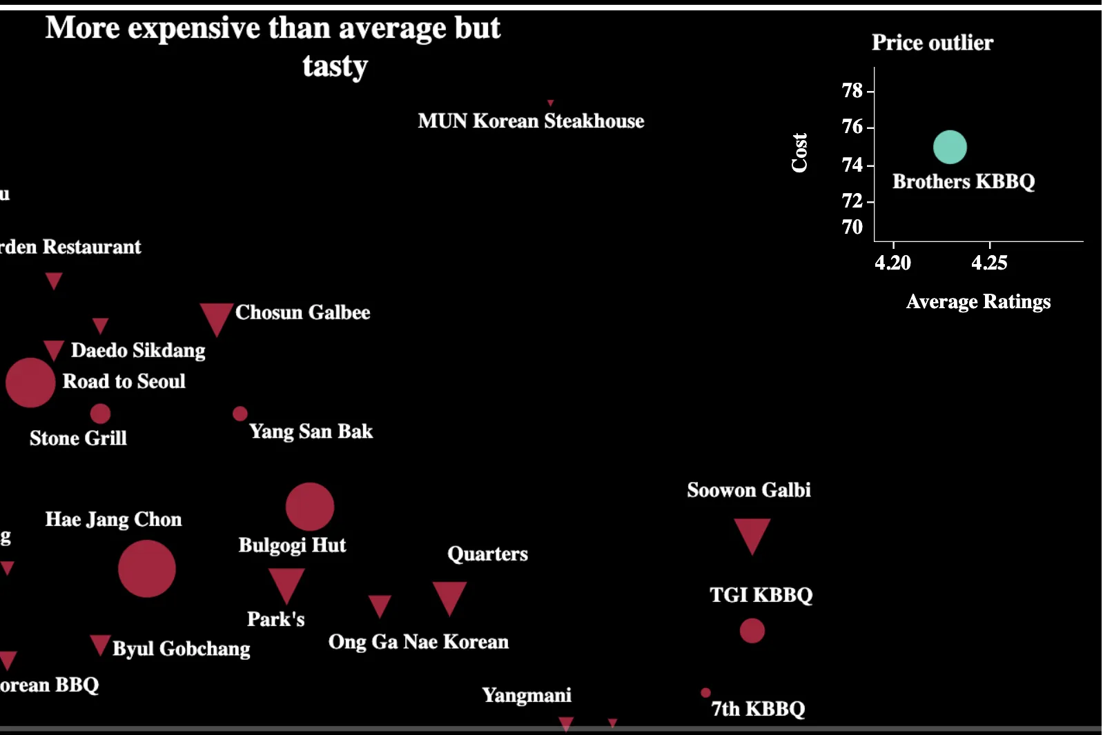
Using different shapes, Rajesh’s chart makes clear one vital distinction in our city’s Korean barbecue scene: AYCE (circles) and non-AYCE (triangles). The size of each data point reflects the number of user-generated reviews each restaurant has received. Most relevant to readers are data points in the upper-right “more expensive than average but tasty” quadrant and lower-right "cheaper than average but tastier" quadrants, but feel free to defend your favorite spot on social media if it falls on the left side of Rajesh’s chart.
On the expensive-but-tasty side of Rajesh’s chart you’ll find Park’s BBQ (one of Time Out’s best citywide restaurants), as well as other perennially bustling joints including Bulgogi Hut, Quarters and Chosun Galbee. A single costly AYCE outlier, Brothers Korean Barbecue, requires its own scale at the top-right portion on the chart.
As any good scientist should, Rajesh acknowledges the imperfections of his data collection process. He neglected to include one of L.A.’s oldest Korean barbecue restaurants, Soot Bull Jeep, which still uses charcoal briquettes to grill meat, as well as Genwa, the upscale-leaning spot with locations in Beverly Hills, Mid-Wilshire and Downtown. Rajesh also admits that his initial method of data collection doesn’t factor in that patrons might order additional pricier à la carte dishes at non-AYCE restaurants, which definitely can up one’s per-head restaurant bill. For example, the chart inaccurately pinpoints AYCE Bulgogi Hut as more expensive per head than Park’s, but this isn’t necessarily the case if you factor in a few à la carte dishes, like the steak tartare, that patrons typically might order at the latter.
Nevertheless, he’s glad the KBBQ chart has received so much attention, and looks forward to trying new spots his endeavor has uncovered, including Wi KBBQ, the highest rated restaurant in the "cheaper than average but tastier" quadrant on the furthest right. The Vermont Avenue strip mall eatery’s owner even messaged him to thank him, Rajesh says, and told him the restaurant received an influx of customers after the chart went viral. "They were super happy," Rajesh adds. "They keep posting the visualization all the time."
Based on other crowdsourced requests, Rajesh has also analyzed Indian restaurants in the Bay Area, the best parathas and beef curry in Kochi, India, and most recently, pizzerias in New York City, among other data comparisons. His U.S. within-city restaurant Tableau charts have made the biggest splash thus far, with the soon-to-be PhD having done interviews with San Jose’s Mercury News and iHeartRadio in the last few months.
In the near future, Rajesh hopes to take what he’s learned from the KBBQ chart for his next food-related dataviz project: tacos, either within cities or between leading taquerias in two cities in California and Texas. "It’s a little bit more straightforward for tacos," he says. “I can choose one of the meats, like carne asada, and base my visualization off of that."
To keep up with Rajesh’s latest work, follow him on Twitter @messidude or Instagram @messidude.food.
Discover Time Out original video